Role
Product Designer
Duration
2 weeks
Tools
Figma
Context
Imagine you're running a business and need a smooth way to manage your invoices and finances. That's where Paper.id comes in – it's a platform that not only helps you create invoices but also lets you disburse funds directly. But there was a problem that made user confused on the Disbursement Features.
Problem

1
User don't know how to disburse their balance
People using Paper.id were having trouble figuring out how to start disbursing their money.
2
User cant discover how to change their desired bank accounts
Sometimes user wants to change their bank accounts for the disbursement. Now the menu is hidden inside the disbursement menu.
Goals
1
Revamp
Revamp the dashboard layout and copywriting to help user understand some of the features
2
Discoverability
Highlight the disbursement features
Solutions
1
Make disbursement features as the main feature in this dashboard by changing the CTA form secondary to primary.
2
Use some familiar component for Dashboard
3
Tidying up the dashboard layout, styles and components arrangement/selection
4
Move add/edit bank account UI that are hidden inside the disbursement menu to the dashboard
Designing Solutions
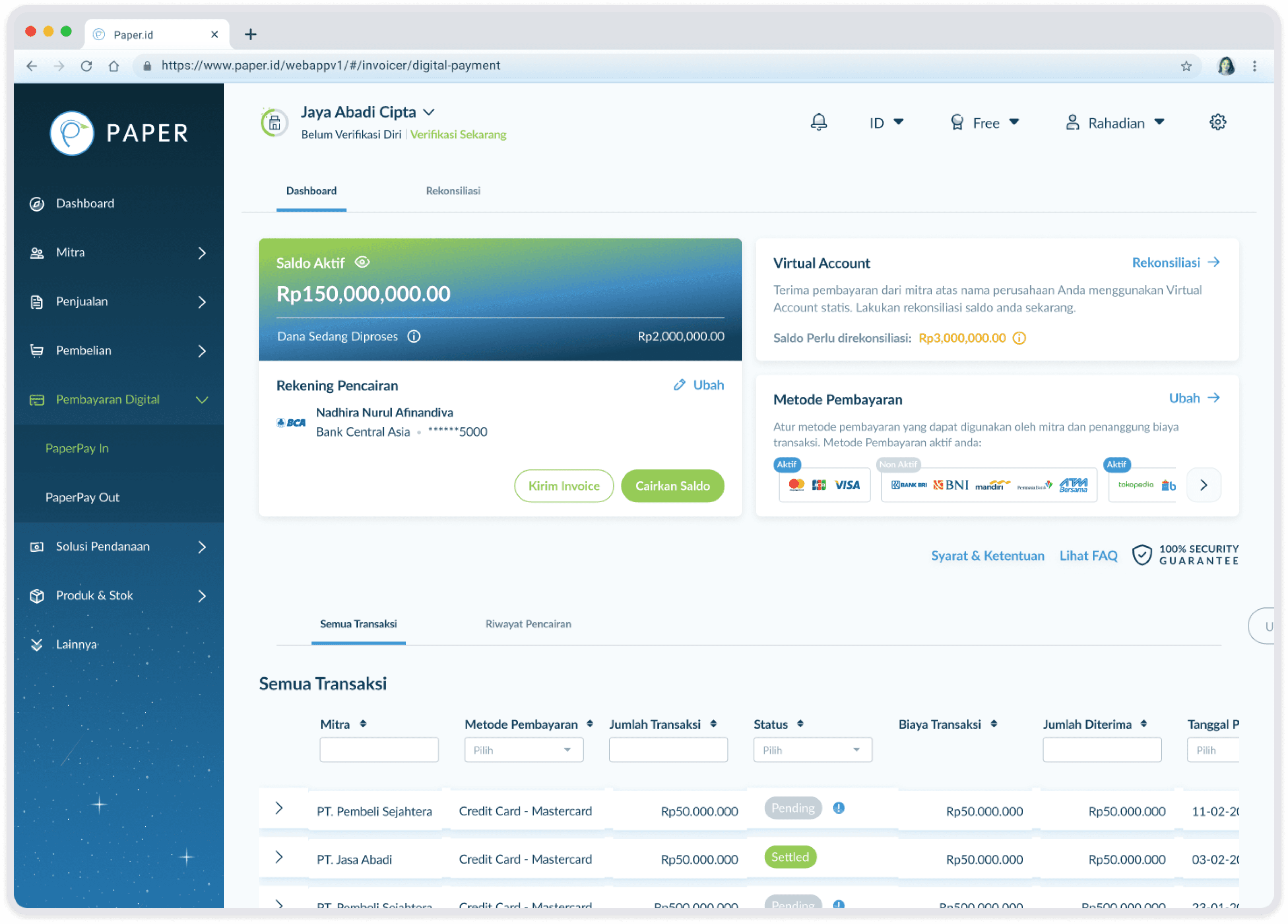
Active Funds Card

Before
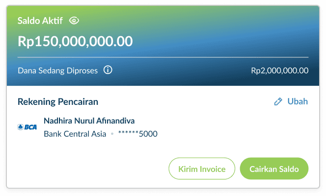
After
Using the same components as the Paper Dashboard for the Active Funds section
Moving add/edit bank account menu that are hidden inside the disbursement menu to the dashboard
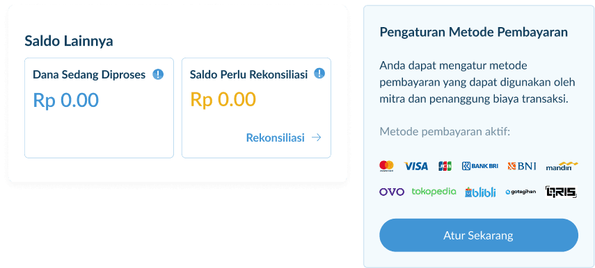
Virtual Account & Payment Methods Card
Before

After
Use some familiar component for Dashboard
Tidying up the dashboard layout, styles and components arrangement/selection
Adding some description for VA and payment method sections
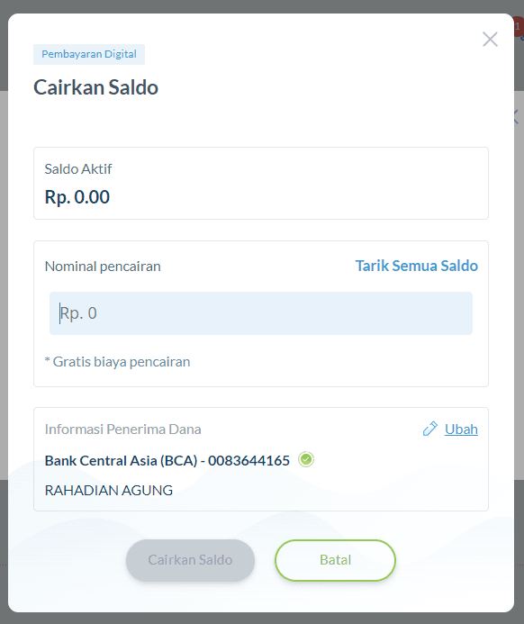
Withdraw Funds Modal
Before
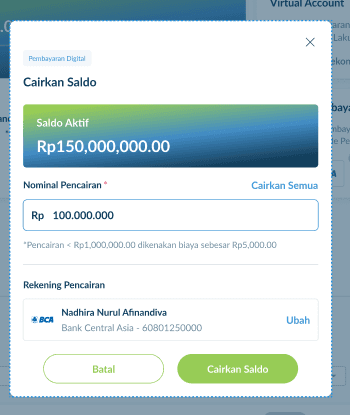
After
Simplifying components in the pop up modal to make scanning easier
Final Design
Before

After
